We’ve chunky-monkeyed up the fun.
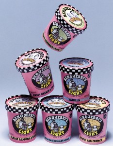
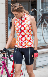
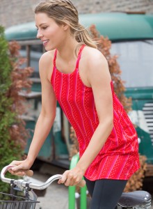
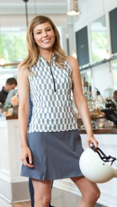
This year’s Terry prints are joyful works of art, created by Lyn Severance, the iconic creative director who gave Ben & Jerry’s its design flavor. Lyn’s original style of illustration, hand-lettering and creative direction set the look that helped drive Ben & Jerry’s appeal. We are big on prints at Terry and we wanted an original collection that speaks the language of cycling. We found her here in Vermont, right in our backyard.
Growing up in Vermont next to her grandfather’s dairy farm, Lyn made “stuff” and doodled type. A brief stint as a metalsmithing major at Syracuse University effectively eliminated that career path. While studying abroad in Scotland, Lyn took a few classes in textile design and calligraphy. It was here that she realized type, illustration, color, and design were her true passions. Upon returning to the States, Lyn went to Parsons The New School for Design in NYC to study Communication Design, fell in love with the intensity of the city, but did long for Vermont. Early freelance clients in Burlington were two guys who had just opened an ice cream shop – Ben and Jerry. In her 18-year tenure with Ben & Jerry’s, from its launch in an old gas station to its adulthood as a global company, Lyn’s style set the look that helped drive Ben & Jerry’s success.
Of course, she’s not all about ice cream. She’s also helped create a distinctive look for Gateway computers, Fat Cat pet toys, outfitted Samosa Man’s corps of employees in custom patterned aprons and packaged Vermints into an internationally graphic powerhouse.
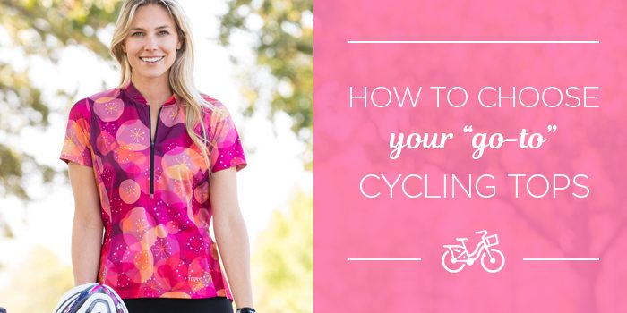
Lyn’s inaugural efforts for Terry apparel really showcase her ability to combine color into a vibrantly energetic palette for bikewear. She’s managed to fall in love and reinterpret the mechanics of a bicycle into something sensual and joyful. Gears, chain links, handlebar tape, wheels all come alive in a completely new way. Here are our favorites…








What fun!. As a former textile designer (and New Hampshirite) I appreciate her style and use of color. I hope to see more short sleeve and long sleeve options for those of us who like a bit more coverage.
Love the new designs and colors. Please consider making the first design on the site a graphic arts print. It would look fantastic and give life to my office wall. And please add a wild print in a conservative cut that flatters a more mature figure.
I wouldn’t mind having the original design as a graphic arts print either, to frame.
I do wish your jerseys weren’t so expensive. Some of us working and cycling girls can’t afford an expensive jersey but still love the beauty of your products.
wow-this is an awesome venture. I can’t wait to see the new catalog-congrats and I hope we see a great response to this collaboration
would you consider selling a poster of this design-I would enjoy seeing this framed in my home
OMG, love the bright colors. I hate to blend into the countryside while cycling. I’ll certainly be seen wearing these jerseys. Can prints to frame be made available?
The new bold patterns and colours are wonderful…now you’re talking…you have convinced me to put some money on my card and make a choice soon