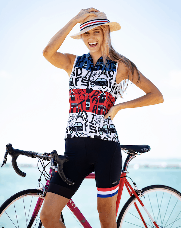
Where do all those cool Terry cycling jersey designs come from?
Every jersey pattern starts with a creative idea – a doodle or spark of inspiration in a designer’s imagination.
Where do those ideas come from, and how are they transformed into the sophisticated jersey designs of Terry cycling apparel – appealing patterns that work with all the technical requirements of athletic gear, and across a full range of sizes?
It’s a complicated business, but here at Terry it’s what we do every day.
Our special Tour de France collection is a great example of our unique creative approach to bike clothing. Let’s take a closer look at what happens behind the scenes, with the team members who create Terry jersey designs.
Creative Director and VP of Marketing, Paula Dyba, is the driving force behind the Terry Tour de France Collection. She considers this work to be one of the highlights of her year.
“I am an admitted Tour de France student. I love everything about it and really became a fan in the early days of Terry, mostly because of Georgena, who was a super fan of the pro peloton. There’s so much history and romanticism for the sport of cycling and for 21 days in July, life can be gloriously consumed by the passion for all things revolving around it.

We celebrate the Tour de France 2019 with our own interpretation of the green jersey – Soleil Long Sleeve Jersey in Stained Glass.
“I have to say that planning for the next season’s Tour collection is my favorite thing to do as Creative Director for Terry. It begins with studying the route just as soon as it’s announced (which is never early enough), coming up with a theme that seems relevant to either the geography or some notable thing (this year was awesome as it was the 100th anniversary of the yellow jersey and the 50th anniversary of Eddy Merckx winning his first of 5 Tours). Next, I put together a Pinterest board with various inspirations that our designer can use to develop print concepts.”
This year’s board featured:
- Eddy Merckx references from his racing career. He raced for Molteni and they had very distinctive jerseys.
- Belgian crests and iconography, as the Tour began in Brussels which has a very deep cycling heritage.
- Sunflower fields, which are also iconic and explode along the countryside in France this time of year.
- Stripes and flags which you see lining all the great climbs during the Tour.
- Fashion inspirations for print treatments around the color yellow.
- Parisian references like the Eiffel Tower
“My job’s easy – our designer has to take all of this and develop a collection around it. Sometimes it’s a literal expression, like the Eiffel19 and Belgian Heart designs. In other cases, it’s very illustrative and artistic, like the Stained Glass print.”
Terry’s lead print designer is Wayne Hammond, who was working on bike graphics at Cannondale when an opportunity opened for him in their apparel division: “I loved it, in a few years time I was the lead designer handling all cut and sew apparel for road and mountain biking, men’s and women’s, sublimated prints from inline collections, to Tour De France Race Kits.”
“I have always been a fan of Roberto Cavalli prints. I like Junya Watanabe, Stella McCartney. I love to follow big sportswear brands like Nike, Adidas, Reebok, Lulu, Athleta, Maloja for both prints & tech.”
Wayne starts a project like the Terry Tour de France Collection with Paula’s creative brief and visual references. With a goal of ten finished designs, he will set out to create multiple variations of 15 to 20 proposals, which will be considered in a series of roundtable discussion with the whole Terry apparel team. Favorites are chosen for further development.
Sometimes a design is shelved that has taken hours and hours of work to create. That can be hard, but Wayne is matter of fact about it. He says, “Some day I’ll fill a book with unused designs just for fun.”
Wayne often starts with very loose sketches for composition, and then transfers into software like Adobe Illustrator and Photoshop to develop designs and prepare them for the technical process of fabric printing.
He starts working on overall design concepts without considering apparel shapes, but adapts those into initial design proposals on a short sleeve jersey pattern for simplicity.
When the first round selections are made, Wayne places the patterns on different garments where zippers, side panels and special patterning come into play. He says designs often get better when those adaptations happen.
Wayne explains the technical considerations, “Terry offers a wide range of sizes and some designs can look completely different on a small size jersey, compared to an XL. Also, artwork that spans across seams is always tricky, you have to be careful, but Terry manufacturers have good print placement and great sewers.”
“While we try not to be overly obvious, designs can be created in a way that can help visually slim the body, you have to be careful that this effect works in all sizes, otherwise it can have a strange effect.”
Wayne definitely has favorites among his creations for this year’s TDF Collection:
“Eddy Fly jersey probably wins my choice. Aside from having a lot of respect for Eddy Merckx, this one took extra time to get right. Apart from multiple variations of the art, I was able to convince the team to try this print on a different garment which better suited the artwork. I was very pleased with the final result. Stained glass would be my second favorite, the art changed a lot during development and just got better and better.”


Leave a Reply